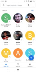
Google's been redesigning the interface of its software across platforms rounding off sharp corners wherever possible - just look at the address bar of the Chrome browser you're probably reading this on. The push for circles is now finally fully embraced on the company's Phone app for Android, too.
The Favorites tab of the default dialer app on Pixel phones had two contacts per row until now, while the other tabs had already switched to circles. The latest update brings consistency between the tabs with circles, circles everywhere, and the contacts are now three in a row. We dug through old reviews to find out it was a lot like this on theNexus 6 running Lollipop in 2014.
As is usually the case, the v27 update may not necessarily be hitting everyone at once - we ourselves had to resort to sideloading it even on the Pixel 3. In any case, it's happening sooner or later.


0 comments:
Post a Comment